omigod i drew a reply to this and somehow in my head I remembered it as an ask about fists but it wasn’t?????????? I WENT COMPLETELY OFF THE SUBJECT and to goodness knows where
SORRY FOR GOING OFF TOPIC i hope the last pic helps w what you were looking for? OH GOSH
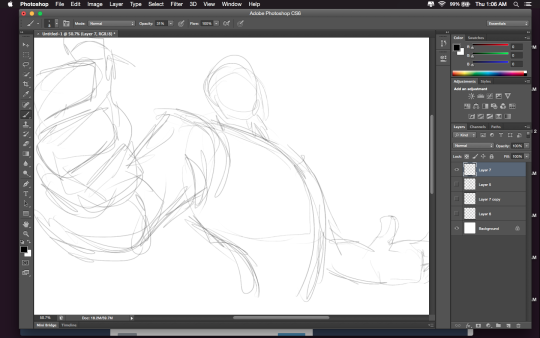
Hey friends! Meg here for TUTOR TUESDAY! Today we take a look at the neck and how it connects to the head and shoulders! Thanks for your patience! If you have any tutorial recs send ‘em in here or my personal. Now go forth and I’ll see you next week!
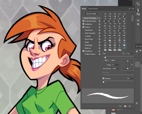
Hi there! My usual brush of choice is the PS default “Chalk 17.” I turn on shape dynamics, scattering (though set rather low), texture, and smoothing. Anything else I might use is from a Kyle Brush pack. 🙂
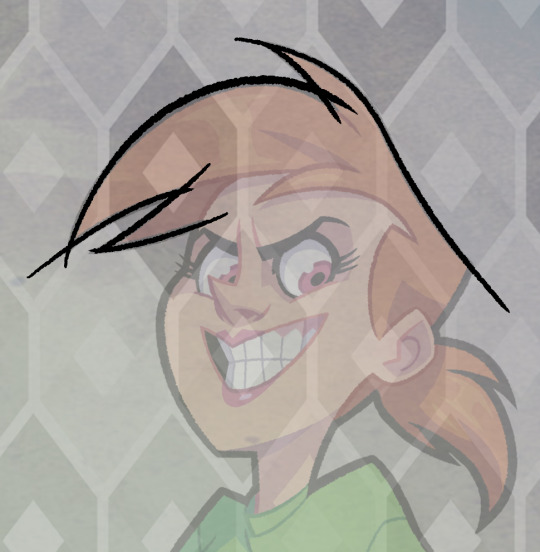
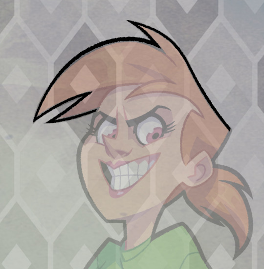
I also get asked a lot how I make my lines so “clean” or “smooth,” so I’ll just go ahead and add a quick explanation.
I make long, fluid strokes, often using my whole arm. The canvas rotate tool allows me to make lines in my nature stroke (bottom left to top right) and ctrl-Z lets me derp around until I feel the stroke is right. I don’t worry about intersections at this point.
I just erase them out afterwards. 😛 Hope that was somewhat helpful!
For those wondering about HOW to do this, here’s a short explanation according to me:
Drawing A to Drawing B: -the most obvious change is the exaggeration of the line of motion in the character.
In Drawing B the line of motion is much more pronounced, creating more drama and movement to the whole composition
-The arms are open wider, showing more confidence and exuberance in the character, exaggerating their emotions so they can be more clearly read without having to look to the face for emotional cues.
-the legs are wider apart, adding to the aforementioned confidence but also giving the character a solid foundation, visually speaking.
-The head is tilted back and overlapped by the chest, adding a touch of dynamic perspective to the drawing.
Drawing B to Drawing C: -Most obvious change is to zoom in on the character. Character framing is just as important as what the character is doing. Zooming in can help infensify emotions. this shot is ALL about this character and what they’re feeling. -Because of the zooming in, the arms/hands would have gotten lost, so instead of making the canvas wider, the artist has elected to rotate the character slightly, bringing a dynamic angle to things and more intensity to the close shot. -While the character is more upright in this shot compared to Drawing B, in Drawing C the chest still slightly overlaps the neck, preserving the feeling of being slightly below the character (putting them in a position of power relative to the viewer), which helps maintain confidence and power in the character. -the chest is exaggerated to carry the majority of the body’s line of action so even though you cannot see the legs, our brains are able to fill in the gap and envision that line of action. -The cropping/framing of the character allows for a more interesting composition/negative shapes created by the positive (character) on the negative (background), creating more visual interest as well as a circular motion to the composition through the arms, across the face to the negative space for the eyes to rest in before dropping to the hand in the background and back through the composition again.
Pretty sure I’ve posted this before. But worth a repost
Thought it might be interesting to show how my Mos Eisley piece breaks down in Photoshop! Despite technically being made up of a ton of layers (just for organization and ease of selection), the final piece breaks down into about five parts: inks, flats, shadows, bounce/atmosphere, and overlay.
Sketch I actually blocked out a small scene in Maya to help me compose this shot – Mos Eisley has a lot of domes and ellipses and, as much as I adore drawing in perspective, it definitely helped having a basic maquette for placing the camera. We had to get the sketch approved by Lucasfilm, so I did a quick value pass to hint at the time of day.
Final Sketch This is where I’m finalizing the composition before inking. This meant fine-tuning figure placement, environment details, and any text I had written on the walls. Luke was almost entirely central in the initial sketch, so I shifted him to the left to let the piece breathe a little more.
Inks The first stage of the final piece, and probably my favourite – I can just turn off my brain, zone out, and ink. Since Star Wars is a notoriously “used” universe, I went for a bit of Geof Darrow vibe and let the inks do a lot of the texture work for me. The inking is actually done over some twelve-odd layers (sandtrooper, Luke, foreground moisture vaporator, etc), but that was just to organize my file and facilitate expedient flatting later on. The final inks are a dark green-blue, with a bit of variation in the distance to reinforce the atmospheric perspective.
Flats This aaaalways takes longer than I expect. This stage changes depending on my process, but I went with pretty basic local colors this time around. Nothing fancy.
Shadows (multiply layer) The shadows are all on 1-2 multiply layers, pretty basic. This was a deceptively simple lighting setup, so I wanted to make sure any edges that were catching light read really clearly. I added the warm rim of subsurface scattering to break up the edges a bit.
Bounce Light and Atmospheric Perspective (screen layers) A couple separate layers, but they serve similar purposes. This stage added bounce light from the sky and sand, as well as layers of atmospheric perspective to separate out the foreground, midground and background.
Final (overlay layers) The final piece! I used a subtle overlay layer to marry the colors, as well as some film grain and light watercolor texture to break up the swaths of flat digital color.
So that’s my jam! I’m changing up and improving my process constantly, but this is definitely one way to get things done. 🙂
threw together a quick little narrated video showing the Photoshop layer breakdown for my Valentina piece! It’s actually a pretty simple process when you get down to it 👌🏼
Well! Let me give you some points of reference that have helped me.
1) Draw from life, as I’m sure you already know. It’s always the first thing people seem to say, but it really does help. “To draw a thing is to know a thing” and all that.
Here are some websites I constantly use for gesture drawing practice, and they both give you the option to focus solely on hands.
2) Tip Sheets. If you just look up hands on Pinterest, you can usually find a bunch of tip sheets that helpfully break the hand down into moving parts. Understanding how something works will always give you better results that just knowing the exterior appearance.
(Normand Lemay is just amazing. You can see more of his tips by looking up “Tuesday Tips with Griz and Norm.”)
3) Studying cartooned versions of hands. Drawing from life is wonderful, but when you’re going for a more illustrative or cartoony style, it can be hard to know the best ways to simple things. Doing quick gestures will naturally help with this, as it focuses you to only records the essential information, but! It’s always nice to study from the masters.
Milt Kahl (the great Disney animator) is probably my biggest influence when it comes to hands.