Hello! this is an effect I see in a lot of artworks and that I use a lot, I tend to see new/younger digital artists (even others who are more experienced) asking me and others quite often how to do it but there doesn’t seem to be many tutorials for how to do it, especially not for Clip Studio Paint. I’m going to try to keep this simple as possible, cause it confuses tf out of me and i only just now learned how to do it in CSP lol
*This can also be/is usually done in Photoshop, but not everyone has photoshop, and there are already tutorials for it I think! Do what u gotta do!
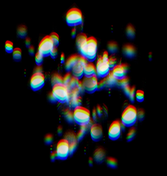
@nevyns thank you so much! (and sorry for the screenshot–xinbox ate my draft)
so, here are the basic stages of that last anders pic. i’ve actually been experimenting a lot with my process lately, though, so this is more in the spirit of shop talk than a tutorial or anything. take from it what you will!
1. Photostudies of people slouching on one leg, pose idea sketches, color test. for a more complex picture i’d do proper thumbnails/comps and way more studies. i’m including this bc it seems like a lot of painting step-by-steps leave out the planning stage, which is really too bad–as a beginner it took me years to knuckle down and do this and figure out how much it helps. time spent planning your image is exponential time saved later. i know i just said this post isn’t advice but this part absolutely is, haha
2-3. Final sketch taken just far enough to get the gesture and proportions down, then straight to blocking in colors. thinking in shape and tone feels easier/more intuitive to me than accurate contour lines, but on the other hand my stuff would probably benefit from tighter underdrawings, so i don’t necessarily recommend this way if lines are easier for you? idk, “how much of an underdrawing do i really need” is one of the things i’ve been experimenting with.
anyway, the important thing here is to make sure the major shapes and value structure are working. if an image doesn’t read at the block-in stage, no amount of polishing will fix it.
4-5. I’m, uh…sorry if this kinda looks like that “draw the rest of the fucking owl” meme. the rest of it is pretty much just “paint til it’s done.” minimal layers, hard-edge brush with some texture, opacity set to pen pressure. i don’t really use a special technical process, so tbh i’m not sure what to say about the render stage without just going off infodumping in 20 directions
which! i definitely don’t mind doing lol. if there’s some particular aspect you’re looking into, i’d be glad to share what i know or point you at some resources. not to be a mushball but i love digital painting A Lot and it makes me super happy to see people getting into it! i hope you’re having a good time 😀
and i hope this was at least a bit useful/interesting. thanks for the ask!
listen binch. no one has an original style. no one pulls a unique style of art out of their ass. we get to where we are through observing others and being influenced by them and that’s how art works
Masking fluid is, essentially, liquid rubber. It adheres to the paper and protects an area from watercolour. When the paint dries, you simply remove it. There are different types of masking fluid, like the ones you apply with a brush. But if you’re like me and want to cut the crap with RUINING BRUSHES: look no further. I exclusively use Molotow masking liquid pens now.
You don’t need sacrificial brushes. It’s tinted blue so you can see where the hell it is. The future is here.
Rolls on like a kickass pen
Let it dry, slap on your watercolour
Coax it off with an eraser
Bam look at that. Perfect for those details you want to stay white. Not recommended for application over large areas. Available on Amazon.
First, comics are exhausting. Seriously like, dragging yourself over a bed of nails for 7 years straight exhausting. If you don’t passionately love what your comic is about and/or you don’t have a style that’s manageable and time-efficient, you’ll find it very difficult to produce your comic to completion.
@cooncomic is done in a super simple but efficient style. I use just Indian ink and a quill. I made it as manageable as possible so I wouldn’t grow exhausted with it over time because believe me, I get tired with even the simplest projects after the first 6 months months. SORRY I’M RAMBLING, THE POINT I’M GETTING AT: cut corners at every available opportunity. Find out the quickest, most efficient way to get the final product that you need. Even if that means relying heavily on digital touchups to support your traditional work.
I scan my pages as a .png (retains more data than a jpg) at 800dpi.
Sometimes the panels are ROUGH. Ink sometimes dribbles, it smears. And often I don’t want to wait an hour+ for large ink areas to dry, so I don’t even bother filling large areas in. I just wait to do it digitally.
Could I have gotten the edited version without using digital effects? Yes. But it would have been far more time consuming than was necessary. For me, the key to not getting sick to death of comic-making is to find a way to get a quality product without sacrificing time. But if I did the comic completely digitally, it wouldn’t have the same soul to it. Personally I don’t really enjoy working digitally and it shows–my traditional art has more personality.
After a page is scanned, I play with the tone curve and contrast until it looks how I want, white out the edges of the page so it’s clean, and then I draw on top with white, sometimes dark colours, for touchups. This differs for each page and depends on what you drew the comic in. Ink scans are easier to edit because ink is so harsh and bold, it’s easy to clean up. So here’s an example with pencil:
Jack with the tone curve tool until it looks contrasted enough. (I also white out the borders of the page where the scan gets darker edges)
Then, on a new layer, I draw on top of the page with white, doing touchups and cleaning up details that didn’t scan well. I always use a natural pencil brush so it looks traditional:
There’s no really right or wrong way to clean up traditional scans, just fiddle with it until you get to the product you want.
Traditionally drawn comics are really underrated, I wish there were more. Best of luck with yours!
I don’t use them for @cooncomic because the pages are very short and straightforward with the briefest dialogue. So for the sake of this answer, I’m talking about my more graphic novel style comic work.
Creating the layout of your panels and the composition within them is an art form in itself. It’s storytelling. You’re showing your audience your story. I always think more along the lines of cinematography than illustration for this.
I begin my composition with the last panel in mind. The final panel of your page–that’s your punchline. That’s your climax. It’s not at the middle, it’s at the end. That very last panel is the one I want to leave the viewer focused on. Awed by. Stung by. Melted by. Humored by. Offended by. Whatever the point of your storytelling was. So that’s where I start and where I put the majority of my focus. My final panel is the punchline that everything else will just be leading up to, whether it’s with the dialogue or just the imagery.
Then I have to come up with composition. How many panels do I need leading up to that final panel? How many snapshots will be necessary to set the scene, the setting, the mood? I need to portray these things in the most concise number of panels. So I do a series of thumbnails playing with different numbers of panels, different arrangements of panels, etc. Typically I do this traditionally, on scrap paper. Very quickly. Scribbles, stick figures. I’m just figuring things out. Unfortunately I don’t have many good examples of this to show, because they’re for upcoming projects I’ve yet to announce.
SUPER rough. I do this every time. I never start a serious comic page without testing compositions on thumbnails to help me pick the arrangement that best suits the flow of the storytelling. I need something that will best lead up to that final panel on each page.
Then I pick the thumbnail with the arrangement of panels I like best and redraw that thumbnail digitally, fleshing out the composition in each panel a little better. You can see examples of that in the top left of these pages I’ve done:
The bulk of my work is traditional, which I scan in and edit/cleanup before posting. Whether it’s a painting, sketch, ink, whatever. If you feel ready to invest in a scanner (which is a next step you might be thinking about!) I really recommend doing a lot of research on people’s (especially artist’s) scanner reviews to pick the best choice for your price range. Most household printers also have a built in scanner and they’re usually not bad. Growing up, I used the scanner built into my parent’s epson printer and while it wasn’t five star quality, I never had a problem with it. I even got my own and used it in college.
Currently I use a Canon Pixma scanner. It maxes out at scanning 600 dpi (bummer, i prefer 800) BUT it’s very thin, lightweight, and CRYSTAL clear. I mean it will scan even a painting’s paper texture with beautiful quality. Absolutely excellent for the price. I chose it after reading other artist’s reviews.
Generally, just a side note, scanners will max out at a scan size of about 9″x12″. You’ll be hard pressed to find a scanner that can scan larger than that and if you do, it will cost a fortune.
But you’re also going to want to edit your scans digitally. Raw scans look gross, no matter how elite your scanner.
Picking a digital program to edit (and/or create with) is a whole different horse! It might take some exploring on your part to find what you like best. If you’re just wanting to clean up your scans, a cheap or possibly free program should do it. I still use Pixelmator, a cheap app on my mac, to do a lot of basic scan editing just because it’s such a quick, lightweight software. But it doesn’t do so well with heavier files, so I also use Clip Studio Paint for edits and draw-overs. CSP is also the program I do all my digital illustrations and animations in and it makes digital comics a BREEZE to set up with panels, margins, bleeds. It’s an absolutely excellent program, a better bargain than photoshop too, though PS remains an industry standard. After my hard drive crashed, I didn’t bother getting PS again and I haven’t missed it at all. Sai and Corel Painter may also be worth looking into. Though I don’t have personal experience with those two, I hear good things about them.
We’re lucky to live in an age of internet reviews being at our fingertips. Do lots of googling to find out which tools will be the best fit for you artistically and financially. YouTube reviews are also helpful! And definitely ask other artists their opinions. Good luck!