My color and detail study of Solomon J. Solomon’s “Samson”. I had to do a larger study of Delilah because I love everything about her in this painting. The expressive pose, and the look in her eyes as she mocks Samson with his cut hair. Also the way Solomon used black/darker colors to frame Samson, then did the opposite by putting lighter, warmer hues behind Delilah and her dark hair/the green-grey on her chest??? It’s so perfect.
U G H. I could talk about this all day, but this study REALLY helped me learn a little bit more about color, painting clothing and using darker shadows, three things I really needed to practice.
my canvas is by default 2000×3000 for sketch, 4000×6000 for color and rendering, unless it’s a print! some of my tarots have been upside of 8000, but that really strains the computer.
For layers i…. usually try to keep figures separate from each other if possible until I get values in, then I’ll render on top.
I love kids they’re all like.. “when i grow up i’m gonna be an astronaut and a chef and a doctor and an olympic swimmer” like that self confidence! That drive! That optimism! Where does it go
It gets destroyed by adults not believing in you and telling you to pick a realistic career. And by society creating all these obstacles to the point that you’re too tired to try.
But they’re not really unrealistic, SOMEBODY is going to be an olympic swimmer and it might as well be you.
Actually I want to talk about this a little more than I did, because olympic swimming is incredible and works perfectly to talk about attaining goals.
I used to be a varsity swimmer, and I was damn good, but I was forced into it by my parents and completely lost my love for it and therein my drive. But in high school I was swimming against such talented swimmers like Olympic Swimmer Missy Franklin. I’ve met her, and the main difference between her and me was that I was strong but had no passion, but she was strong BECAUSE she had passion.
And I could have been good, really good, maybe even Olympic good. I even have the predisposition for it, been swimming since I was 2 years old, have a mom who was almost an olympic swimmer. Missy didn’t have either of those things, she just wanted it, loved it, had been doing it for a long time, and decided she was going to kick ass at it.
Right, that’s great and all, but I completely missed my opportunity to be an olympic swimmer, yeah? and can never achieve those dreams I had as a kid? No, not even though. There was this whole thought that female athletes peak when they’re 17 years old and lose their skills quickly after that, and male athletes peak around 19. But then Olympic Swimmer Dara Torres shows up. She was an olympic swimmer when she was 17, 21 and 25. Pretty normal age for retirement. She had a few kids. She kicked butt at being a mom.
And then at 33 years old she decides she’s bored or something gets back in shape and kicks so much ass at the trials that she lands herself on the Olympic Team ONCE AGAIN. And then 8 years later, she decides, heck I’m 41 now, no one has ever made the olympic swim team as old as I am, I want to get in shape yet again and teach these children how sports work.
And she still has the record for oldest US Olympic Swimmer, not even any men have beat out that record.
So basically what I’m saying is you could be an olympic swimmer, you really could be. And there are obviously a lot of things stopping you and trying to get in your way: your brain, society, too much chocolate cake for example. But if you really dedicate yourself to it and love it with all of your heart you could, you really could.
And lets say olympic swimming isn’t your jam? That’s cool too. There isn’t a single skill in this world that you can’t learn if you absolutely love it and want to. Any skill you want is going to take time. There are countless famous people who started learning a skill after 20, 30, 40, or even 50. Not a single person has even been president under age 35 (most likely because you’re not allowed to be, but there’s a reason for that). Whatever you want to do you’re probably going to be bad at first, and I’m talking really shitty.
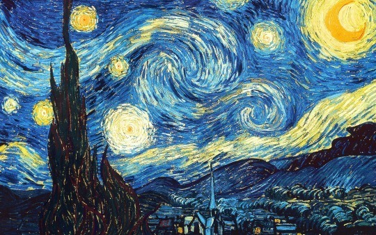
Van Gogh got started in his 20′s and was thought to have no artistic talent at first and was forced to sit in the back of classrooms where the worst artists in the class sat. So yeah you’ll probably be bad, like really bad and everyone including you will think you’re bad. If you stick with it though, if you’re willing to work for years and years, if you keep loving it after all the pain it’s given you,
then you might just paint Starry Night.
#looks like there’s still time for me to learn how to draw
… YES. As someone who started drawing at 35 and who always was like: ‘eh, I can’t draw a stick figure to save my life, but I would love to be able to’ this is near and dear to my heart. If you want to draw, start drawing. Keep drawing. Be shit at drawing at first. Keep it up, doodle things on scraps but also draw stuff you don’t think you can draw. Challenge yourself, you will be surprised what you can do. It will be frustrating at times, but it will also be awesome. It is SO much a matter of practice and dedication, not talent.
This applies for writing, too.
Don’t ever think for a second that it doesn’t! Want to start writing? Then write! You will get better the more you write, the more often, and you will improve, all of the time, as long as you dedicate yourself.
The worst lie we tell ourselves is “it’s too late.”
hey, thanks so much! this might get a lil long (as it always does!!) so bear with me.
firstly i want to say, there’s no right or wrong way to pick colors. every artist has their own palette they prefer and i think it’s super delightful to spend time developing your own special sense of color. so even though i’m explaining things in a “this is how you do it” sort of way, it’s not the only way! just my way. the best method to develop your own sense of color is to look at a LOT of art, look at a LOT of the world around you, and practice practice pratice.
at this point in my life i pick colors intuitively just because i think it’s something i’m naturally tuned into, and i’ve been doing it for a few years, so i don’t actively plan my palettes. but here are some things that i think about as i pick colors.
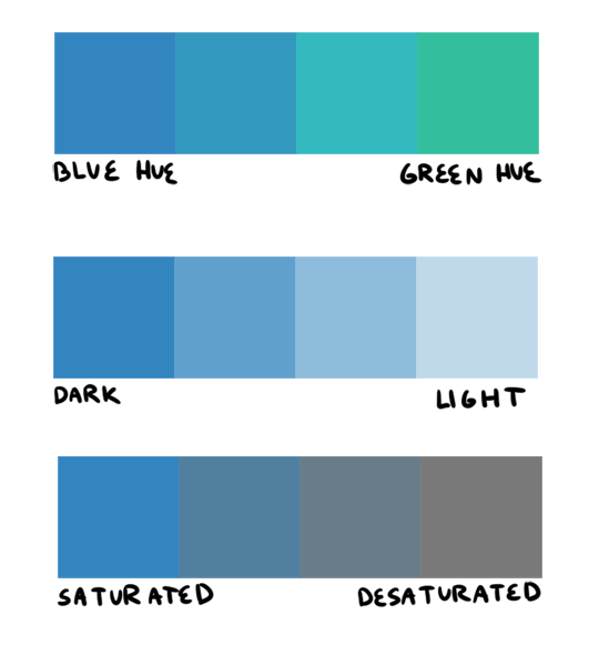
firstly, i want to go over hue, value, and saturation. i’m sure everyone knows these intuitively but i want to explain them in words. hue, value and saturation are what make up a color, and decide how colors differ from each other.
hue: what color the color actually is. red, purple, green, yellow, and everything in between.
value: how light or dark a color is. if you’re painting traditionally, adding more white or more black to a color lowers or raises its value.
saturation: how “pure” the color is vs how much neutral tone is in it.
here’s an example of all three:
this comes into play because a big mistake i see beginners make is that they pick a “just” color, and by that i mean they pick “just blue” or “just yellow”. imagine buying a set of oil paints and only using paints straight from the tube without ever mixing. it would be impossible! so i try to avoid picking “just” colors, except as for a complementary color (more on that in a bit). here are some variations of a red, for example.
so, the biggest thing for me when i pick colors is that i want them all to be friends. i want them all to have something in common so that they get along. i usually lose control of a painting when my colors feel to different from one another. so, i will usually start a painting with one color i know for sure i want, and “subordinate” other colors to it, meaning every other color i pick has to look good with that color. as to how you figure out what looks good and what doesn’t, that just takes time and lots of observation to build a personal opinion 🙂 here’s an example from one of my paintings. in this case, the main color is the trees.
and here’s another from rick & morty, the main color is the sky this time.
now that that’s out of the way, i’m going to give you the Actual Cheat Sheet for color palettes. in color theory, there are 8 basic color schemes that are generally pleasing to look at. here they are.
i usually use an analogous palette or monochrome palette out of preference. the two examples above more or less fall into those categories. however, i also like to use split complementary because the complimentary color adds a LOT of contrast and visual interest. it’s great to use if you have a specific thing in a painting you want to draw attention to. here’s an example:
it doesn’t always have to be a perfect split complementary, just one color that differs from the “family” of colors that take up a majority of the piece.
now! you might be wondering when’s the right time to subordinate a color, or where to put it, or how much of it to use, etc. and the answer is: CONTRAST. there is always visual interest in things that are different. i was rifling through my school notes and found these great types of contrast when working with color.
value: things that are light vs things that are dark.
hue: two colors that look different. I.E. yellow vs blue.
saturation: things that are saturated vs things that are desaturated.
proportion: note the example above. a majority of the painting is orange, so the green stands out because there is proportionally less of it.
temperature: things that are warm vs things that are cool.
complementary: red vs green, blue vs orange, yellow vs purple. when in doubt, these colors always contrast against each other because they have nothing in common (there is no red in green, etc).
simultaneous: this is a little advanced and i’m bad at explaining it, so please read up on it here.
a super helpful exercise is to look at your favorite illustrations, paintings, photographs, designs, etc and assess which one of the 8 color schemes (linked above) it has, and which types (can be more than one) of contrast it has. we did this in school and it REALLY helped me look at color better. here’s part of the assignment i did, the artist is annette marnat.
so! that’s pretty much how i think about color and how i pick my colors! i hope it was somewhat helpful! there’s so so so so much about color theory i can’t even begin to cover, i highly urge you to watch some videos and read some books and articles to further your study. a great starting place would be this series of videos. these are made by my teacher Richard Keyes, i think he had a dvd or something. everything i’ve talked about so far i learned from him and he is an absolute expert in color. these videos are invaluable. if you take anything away from this post, let it be to watch these videos hahaha.
to answer your question about my color leads, every painting was a collaborative effort between the three of us, and sometimes other painters too. it was a very hands-on crew, so i can’t say any of the r&m bgs i did are 100% “mine”. however, i think my personal color sense is waaaay different than jason or phil’s, which made the process very interesting because we usually had 3 very different opinions hahaa. you can check out their work here and here to see what things they brought to the table in relation to my own contributions.
thank you for the ask! again, i hope this was helpful 🙂
This confusion about using references continues to baffle me. Every single professional artist uses references, whether that be during the initial design and composition stage alone, or throughout the entire work from start to finish, or any mix in between, artists use references.
the greatest skill a woman can learn for herself is self reliance
to clarify … so many strong women in my life rely on men. that dependence is dangerous. ladies here are some good ref resources I’ve found helpful on my journey towards self reliance
Thank you friend! I use Photoshop CS5 currently for all my pixel art, but I’m trying to expand to Aseprite as well, as it has a specific focus on pixel art. I’m not quite used to it’s animation though so sometimes I get impatient and switch back to PS for ease LOL. But if you want to do pixel art and can’t afford super expensive programs, Asesprite is literally 15 bucks. Super cheap, yet super effective. And a lot of professionals use it!! Mortmort has great tutorials on it (and pixel art in general). I may not be used to asesprite 100% yet, but I’ve heard those who are used to it definitely prefer it’s animation compared to photoshop.
So, a lot of people draw pixel art differently. When I first started, I did the outlines with detail, and then colored them in (like this piece from 2012). But now my process is usually do loose outlines, color them in sloppily, and then step by step fill in the details (like these pieces for example).
over all I think pixel art is done in two ways: outline first, then coloring. Like- for comparison- how graphic novels are typically done.
or with blotches of colors that roughly paint the silhouette of objects or scenes and are later straightened out into details. Almost like a Bob Ross way of pixel art, for comparison again.
I find myself switching between these two styles (or a blend of the two) depending on whether or not I want my pixel art to have defined outlines or not. I guess these methods of pixel art can also depend on whether you’re making just a single character or an entire background.
there are people who draw pixel art on one layer (which is the same as drawing with paint or pencils on paper, you got one sheet) but I find with pixel art having layers (which aseprite or photoshop, and in general most digital art programs provide) is a huge help. I actually have a habbit of keeping process of the pixel art pieces i made (even if I don’t always post them as gifs) and keeping that process by using layers for each step is a huge help for me. Of course, pixel art is still always possible on one layer like Microsoft Paint.
Most important though: pixel art is art- not a science or a list of rules, and can be done in a variety of ways. It can take a while to get in a comfortable progress (it took me a while at least, I felt a bit awkward and slow making pixel art for the first year or so), but honestly if you just keep practicing you’ll eventually get to a point where you don’t think about it, the outlines, coloring, details all become second nature!
I hope this helps you friend!! Good luck pixel art is a lot of fun! Just be sure you’re having fun making whatever it is you want to make 🙂