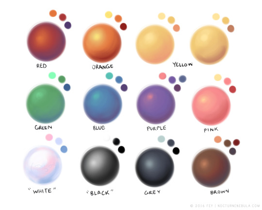
I also think something I’ve struggled with in digital has been colorpicking?? with traditional media it’s really easy to limit your palette and you can mix a ton of different colors that’ll all look cohesive bc you’re starting out with the same few, but in digital you have a WHOLE SPECTRUM to choose from, and it’s hard to pick colors that really look nice and make sense together
You can still do that with digital.
If I wanted to go Full Bob Ross right now and put some Alizarin Crimson, Prussian Blue, and Sap Green on a palette, I could do it easily. I’d just have to pick out those colors first. And then make a palette from that.
The spectrum is your paint store.
If you need to pick colors you’re familiar with—like some oil colors you already have—you can totally do that. And you should! Hell, I get palettes everywhere. I once made a painting based off a bag of Starburst.
Don’t think of that big intimidating spectrum in Photoshop or Corel as your palette. Think of it as being the store. Bring a list with you when you go shopping.
Hi! Happy Tuesday! Today’s tip is on one of my favorite subject, color theory; specifically on chromatic fringe.
It is the red fringe or hot saturated color you see at the edge of cast shadow and where it meets the light area. The rougher the object edge casting the shadow or the further away the object is, the more red fringe you’ll see. This is different than chromatic abberation, which is color fringing caused by lens failure. You can see chromatic fringe with your eyes. The more you paint from life and make observation, the easier it is to see. It’s one of those things that once you see it, you cannot unsee. 🙂 XO,
Griz
#griz #grizandnorm #tuesdaytips #colortheory #chormaticfringe #grizandnormtuesdaytips #grizandnormkittycatclub
ps. On stylized painting, where you want to have a hard edge on a shadow, you don’t always have to put it. Like everything in art, you can choose to put something in or not. But it’s always good to know your basic and know the rules before breaking it. Happy painting!
A few people have asked about this recently so I tried to break down my method of painting faces to the best of my ability. I personally like to use gritty chalky brushes, and this particular painting was mainly done with this brush by Mark Winters.
Process tutorial with a lot of art theory tips mixed in! Definitely a valuable resource!
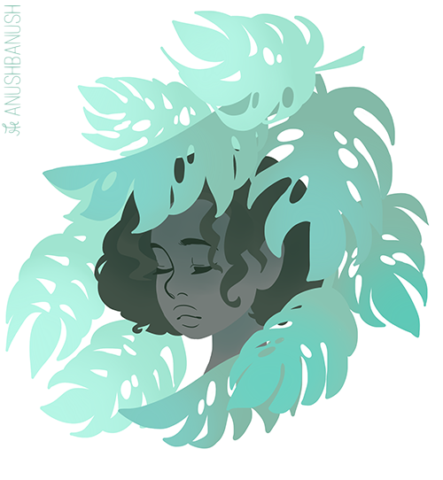
UHH tbh the way I color hair is very inconsistent.. I change it a lot but I kinda explained it here and also here’s a short step by step, hope that helps!
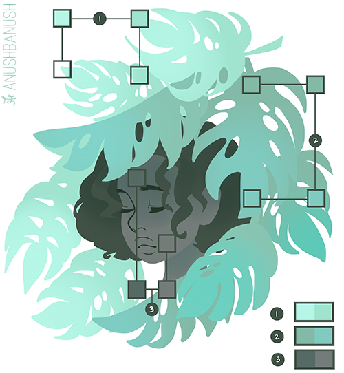
2. Add a lighter color or a darker color to the original color in order to add more value to the flat colors.
If you look at the image below it shows the comparisons of the new color that was added to the original color in order to see the difference between the two.
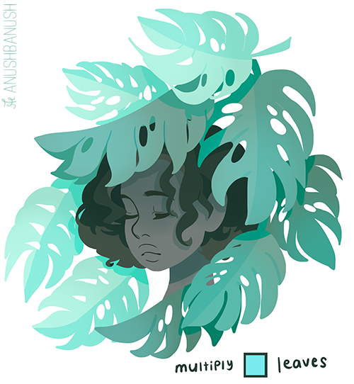
3. Add the shadows in order to show which object is above another object. To create the shadows I used the colors shown below and set them to ‘multiply’. This adds more depth to your work.
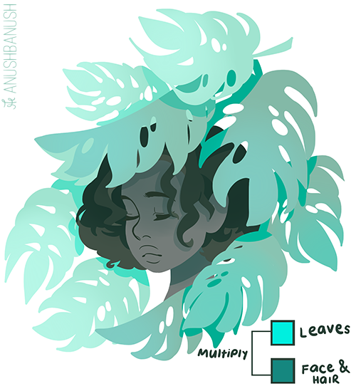
4. Use ‘multiply’ to give more emphasis on certain aspects on your work. Like for example the leaves.
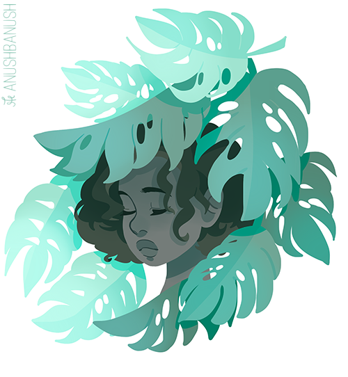
5. Add the finishing touches and you are done!
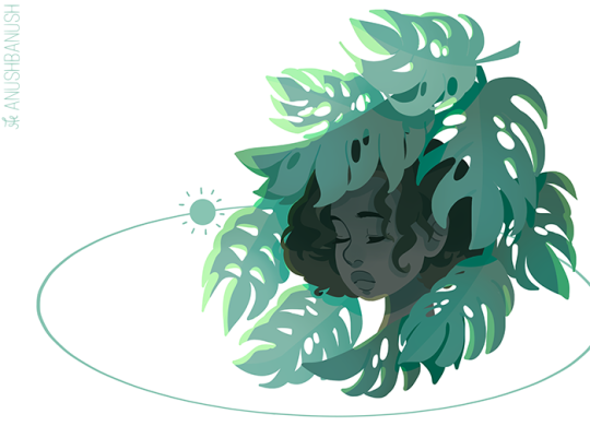
Shading (with a specific light source)
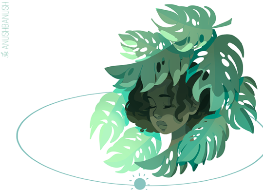
All you gotta do is determine where the light source is. In the image below, the light source is the sun. The little sun will guide you on which parts should be illuminated or shaded.
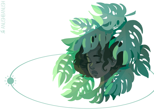
Here are some examples:
In order to see the difference that shading can do, here is a process gif!!!
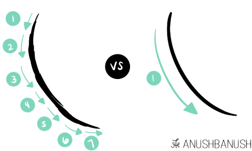
As for lines, I believe that everyone’s style is different. Some choose to do little strokes while others do just one big stroke. As for me, I just do one big stroke in order to maintain the fluidity and consistency of the line. Here is a picture of comparison:
If you want smooth lines then just try and draw it in one swift movement. If you don’t get it right, don’t erase the part that went wrong (because it will be obvious that it’s no longer one line but 2 lines because the continuity of the original line and the new line won’t be the same). You have to redo the whole line from the beginning.
If you practice this a lot you will notice that your lines will be better and at the same time, you will work faster because you don’t have to do so many strokes. Btw when you draw the line do it fast, like really fast, so that you won’t encounter any mistakes.
Just draw a lot and you will get the hang of it and I also hope you know that each artist has their own style. So maybe the one swift stroke works for me but the many short strokes work for you. Just draw in a way that’s more comfortable to you. Anyway, hope this was helpful and have a good day!