Note from a graphic designer who has to fix this shit all day: rich black is prettier sure but for the love of the gods don’t use it for text if it’s going on newsprint. If its anything other than solid black it will bleed out and become unreadable.
Half my job is fixing this mistake all day from people who really really should know better. And now you know!
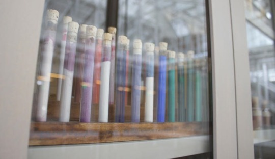
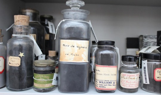
Harvard has a pigment library that
stores old pigment sources, like the
ground shells of now-extinct insects,
poisonous metals, and wrappings from
Egyptian mummies, to preserve the
origins of the world’s rarest colors.
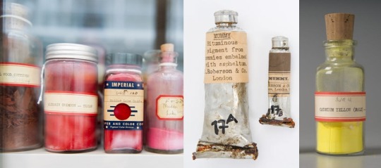
A few centuries ago, finding a specific color might have meant trekking across the globe to a mineral deposit in the middle of Afghanistan. “Every pigment has its own story,” Narayan Khandekar, the caretaker of the pigment collection, told Fastcodesign. He also shared the stories of some of the most interesting pigments in the collection.
Mummy Brown
“People would harvest mummies from Egypt and then extract the brown resin material that was on the wrappings around the bodies and turn that into a pigment. It’s a very bizarre kind of pigment, I’ve got to say, but it was very popular in the 18th and 19th centuries.”
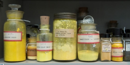
Cadmium Yellow
“Cadmium yellow was introduced in the mid 19th century. It’s a bright yellow that many impressionists used. Cadmium is a heavy metal, very toxic. In the early 20th century, cadmium red was introduced. You find these pigments used in industrial processes. Up until the 1970s, Lego bricks had cadmium pigment in them.”
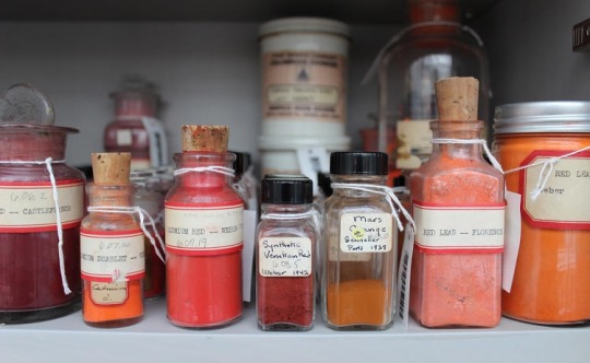
Annatto “The lipstick plant—a small tree, Bixa orellana, native to Central and South America—produces annatto, a natural orange dye. Seeds from the plant are contained in a pod surrounded with a bright red pulp. Currently, annatto is used to color butter, cheese, and cosmetics.”
Lapis Lazuli “People would mine it in Afghanistan, ship it across Europe, and it was more expensive than gold so it would have its own budget line on a commission.”
Dragon’s Blood “It has a great name, but it’s not from dragons. [The bright red pigment] is from the rattan palm.”
Cochineal “This red dye comes from squashed beetles, and it’s used in cosmetics and food.”
Emerald Green “This is made from copper acetoarsenite. We had a Van Gogh with a bright green background that was identified as emerald green. Pigments used for artists’ purposes can find their way into use in other areas as well. Emerald green was used as an insecticide, and you often see it on older wood that would be put into the ground, like railroad ties.”
it’s such a simple yet hard concept to grasp, right? i’m having loads of trouble starting since there’s no exact tutorial for it, so you’ve gotta broaden your search for the topic.
recommendations:
i recommend watching speedpaints to get a better understanding on how other artists do it
the color study tag on here has loads of pics to take inspiration from
this book called ‘color and light’ by james gurney i’m borrowing from a coworker has tons of stuff that goes deep within the understanding of color (it’s a LOT to take in, i’ve had this for 3 weeks and i still haven’t finished it)
i have a pretty basic understanding on choosing colors so i usually eyeball it instead from reference photos. but if you’re a beginner you need someplace to start, picking colors off the pics would be good, but don’t rely on it too much. it often leaves your drawings pretty bland since you’re straight up copying from the camera lens.
2) keep things quick and simple
you’re doing a color study, not an environmental study. i’m having trouble with over detailing my pieces but i’m making a conscious effort to stop caring since the main focus here is the colors, their relationship with the surrounding (even the sky has fricking layers i need to properly understand)
3) pick a picture that inspires you!
i usually pick out photos who has a clear contrast on stuff, so you’d wanna work on something that really attracts your eyes. google is a friend, don’t forget that. it’s better to reference of real life photos than fanart, and plus movie still/screencaps are a good place to see how the colors work out together
4) study your fave artist pieces
pick a piece you like the most and study it. what makes it attractive to you? why does this shade of pink go well with this sort of blue? you can color pick the piece and study their pattern in picking colors, some artists are using the same sort of color palette and it makes them stand out. try to find out why and experiment that method on your pieces of artwork.
so these are the only things that i have on my plate right now, and i still have a loooong way to go, lol. hope it helps!
Palette challenge!! Request a character and a palette and I’ll draw it for you! You’re also allowed to ask for an au (like, characters with wings and stuff like that. Fandoms I’m willing to draw for in the tags)
hey, thanks so much! this might get a lil long (as it always does!!) so bear with me.
firstly i want to say, there’s no right or wrong way to pick colors. every artist has their own palette they prefer and i think it’s super delightful to spend time developing your own special sense of color. so even though i’m explaining things in a “this is how you do it” sort of way, it’s not the only way! just my way. the best method to develop your own sense of color is to look at a LOT of art, look at a LOT of the world around you, and practice practice pratice.
at this point in my life i pick colors intuitively just because i think it’s something i’m naturally tuned into, and i’ve been doing it for a few years, so i don’t actively plan my palettes. but here are some things that i think about as i pick colors.
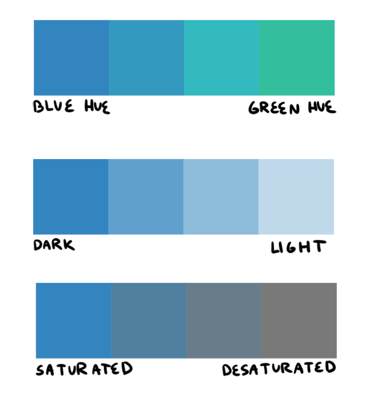
firstly, i want to go over hue, value, and saturation. i’m sure everyone knows these intuitively but i want to explain them in words. hue, value and saturation are what make up a color, and decide how colors differ from each other.
hue: what color the color actually is. red, purple, green, yellow, and everything in between.
value: how light or dark a color is. if you’re painting traditionally, adding more white or more black to a color lowers or raises its value.
saturation: how “pure” the color is vs how much neutral tone is in it.
here’s an example of all three:
this comes into play because a big mistake i see beginners make is that they pick a “just” color, and by that i mean they pick “just blue” or “just yellow”. imagine buying a set of oil paints and only using paints straight from the tube without ever mixing. it would be impossible! so i try to avoid picking “just” colors, except as for a complementary color (more on that in a bit). here are some variations of a red, for example.
so, the biggest thing for me when i pick colors is that i want them all to be friends. i want them all to have something in common so that they get along. i usually lose control of a painting when my colors feel to different from one another. so, i will usually start a painting with one color i know for sure i want, and “subordinate” other colors to it, meaning every other color i pick has to look good with that color. as to how you figure out what looks good and what doesn’t, that just takes time and lots of observation to build a personal opinion 🙂 here’s an example from one of my paintings. in this case, the main color is the trees.
and here’s another from rick & morty, the main color is the sky this time.
now that that’s out of the way, i’m going to give you the Actual Cheat Sheet for color palettes. in color theory, there are 8 basic color schemes that are generally pleasing to look at. here they are.
i usually use an analogous palette or monochrome palette out of preference. the two examples above more or less fall into those categories. however, i also like to use split complementary because the complimentary color adds a LOT of contrast and visual interest. it’s great to use if you have a specific thing in a painting you want to draw attention to. here’s an example:
it doesn’t always have to be a perfect split complementary, just one color that differs from the “family” of colors that take up a majority of the piece.
now! you might be wondering when’s the right time to subordinate a color, or where to put it, or how much of it to use, etc. and the answer is: CONTRAST. there is always visual interest in things that are different. i was rifling through my school notes and found these great types of contrast when working with color.
value: things that are light vs things that are dark.
hue: two colors that look different. I.E. yellow vs blue.
saturation: things that are saturated vs things that are desaturated.
proportion: note the example above. a majority of the painting is orange, so the green stands out because there is proportionally less of it.
temperature: things that are warm vs things that are cool.
complementary: red vs green, blue vs orange, yellow vs purple. when in doubt, these colors always contrast against each other because they have nothing in common (there is no red in green, etc).
simultaneous: this is a little advanced and i’m bad at explaining it, so please read up on it here.
a super helpful exercise is to look at your favorite illustrations, paintings, photographs, designs, etc and assess which one of the 8 color schemes (linked above) it has, and which types (can be more than one) of contrast it has. we did this in school and it REALLY helped me look at color better. here’s part of the assignment i did, the artist is annette marnat.
so! that’s pretty much how i think about color and how i pick my colors! i hope it was somewhat helpful! there’s so so so so much about color theory i can’t even begin to cover, i highly urge you to watch some videos and read some books and articles to further your study. a great starting place would be this series of videos. these are made by my teacher Richard Keyes, i think he had a dvd or something. everything i’ve talked about so far i learned from him and he is an absolute expert in color. these videos are invaluable. if you take anything away from this post, let it be to watch these videos hahaha.
to answer your question about my color leads, every painting was a collaborative effort between the three of us, and sometimes other painters too. it was a very hands-on crew, so i can’t say any of the r&m bgs i did are 100% “mine”. however, i think my personal color sense is waaaay different than jason or phil’s, which made the process very interesting because we usually had 3 very different opinions hahaa. you can check out their work here and here to see what things they brought to the table in relation to my own contributions.
thank you for the ask! again, i hope this was helpful 🙂
Not to critique evolution, but I would think orange and black stripes wouldn’t be as good for camouflage in a forest as, say, green and black would.
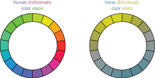
It turns out a lot of animals can’t see the difference between orange and green! Elephants, for instance, have dichromatic vision (two types of cones, rather than three like most humans.)
Check out this diagram from ResearchGate. It deals with the color vision of horses, who are also generally dichromatic. (I think, though I’m not sure, that zebras would have the same color vision as horses.) See how orange and green look to them?
Not to critique evolution but I think prey animals should be better at telling when their predator is dressed like a traffic cone.
It doesn’t matter what zebras see, because tigers are not native to Africa and do not naturally hunt zebra. Tigers are Asian and mostly hunt animals like deer, elk, and buffalo. These aren’t animals with great color vision. They don’t need to have it because they don’t eat fruit and so don’t need to know when the berry is ripe vs when it’s not. Good color vision is too expensive to have if you don’t need it. Deer put their vision stats in a wide field of vision that is sensitive to motion, low light capabilities, and possibly seeing UV light. They don’t have great color and lack a lot of acuity, but have a great sense of smell and good hearing. That’s way more useful if you’re prey. Deer see well in the blue end of the color spectrum and less well in the red. This makes sense because deer are most active in the dawn and dusk periods, when there is more blue in the light. Tigers are taking advantage of deer eyesight by being orange.
We see tigers are being obviously colored because tigers are fruit colored to our tree ape brains.
I don’t know what the best part of this is: implying that deer chose their attributes on a character sheet, or the fact that we get to see tiger colors because they look like a snack.
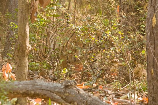
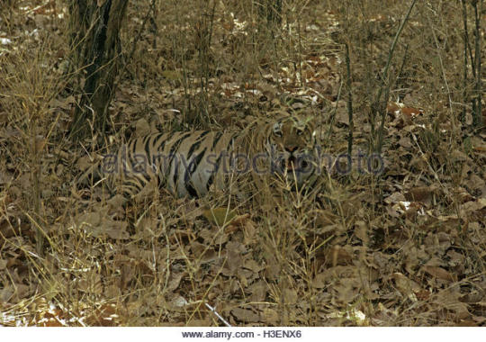
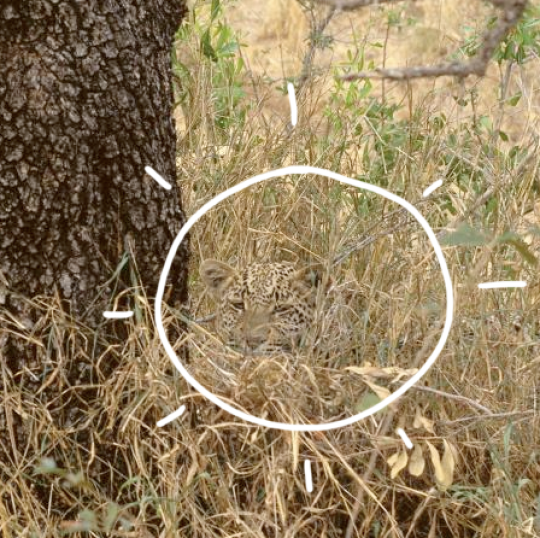
Ok but like, I think you underestimate just how well they blend in when actually in the environment. Like, just using tigers as an example.
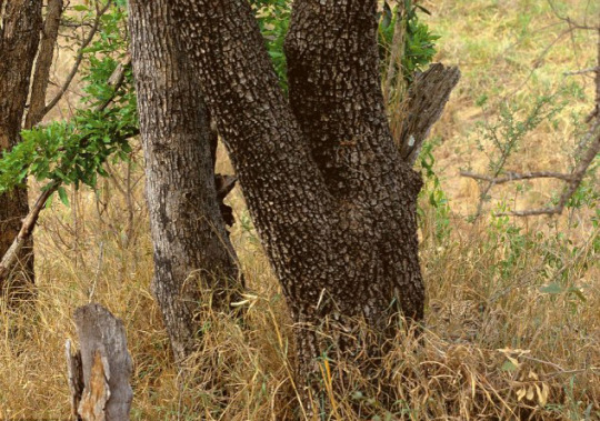
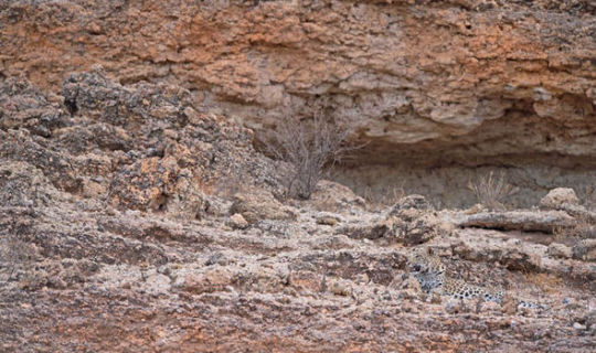
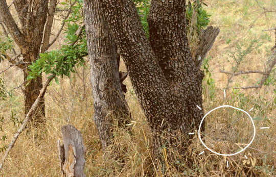
or how about a leopard?
It’s called ‘disruptive colouration’ because the markings help to break up the animal’s outline against the grasses or rocks. And the rosettes on leopards and jaguars? Sun spots shining through the trees and leaves on the ground.
And this is how hard it is to spot them WITH colour vision. Now imagine the above images but with the limited coloured mentioned above?
I’m sorry but there is not an animal in that first leopard picture
Are you, sure about that?
“Tigers are fruit colored” is my new favorite phrase.