hey, thanks so much! this might get a lil long (as it always does!!) so bear with me.
firstly i want to say, there’s no right or wrong way to pick colors. every artist has their own palette they prefer and i think it’s super delightful to spend time developing your own special sense of color. so even though i’m explaining things in a “this is how you do it” sort of way, it’s not the only way! just my way. the best method to develop your own sense of color is to look at a LOT of art, look at a LOT of the world around you, and practice practice pratice.
at this point in my life i pick colors intuitively just because i think it’s something i’m naturally tuned into, and i’ve been doing it for a few years, so i don’t actively plan my palettes. but here are some things that i think about as i pick colors.
firstly, i want to go over hue, value, and saturation. i’m sure everyone knows these intuitively but i want to explain them in words. hue, value and saturation are what make up a color, and decide how colors differ from each other.
hue: what color the color actually is. red, purple, green, yellow, and everything in between.
value: how light or dark a color is. if you’re painting traditionally, adding more white or more black to a color lowers or raises its value.
saturation: how “pure” the color is vs how much neutral tone is in it.
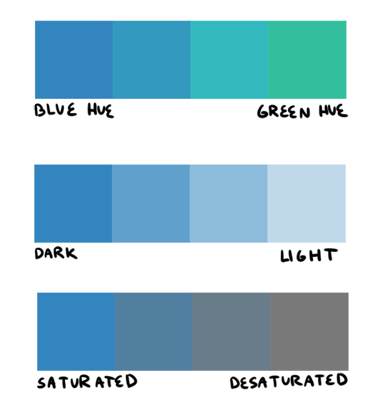
here’s an example of all three:
this comes into play because a big mistake i see beginners make is that they pick a “just” color, and by that i mean they pick “just blue” or “just yellow”. imagine buying a set of oil paints and only using paints straight from the tube without ever mixing. it would be impossible! so i try to avoid picking “just” colors, except as for a complementary color (more on that in a bit). here are some variations of a red, for example.
so, the biggest thing for me when i pick colors is that i want them all to be friends. i want them all to have something in common so that they get along. i usually lose control of a painting when my colors feel to different from one another. so, i will usually start a painting with one color i know for sure i want, and “subordinate” other colors to it, meaning every other color i pick has to look good with that color. as to how you figure out what looks good and what doesn’t, that just takes time and lots of observation to build a personal opinion 🙂 here’s an example from one of my paintings. in this case, the main color is the trees.
and here’s another from rick & morty, the main color is the sky this time.
now that that’s out of the way, i’m going to give you the Actual Cheat Sheet for color palettes. in color theory, there are 8 basic color schemes that are generally pleasing to look at. here they are.
i usually use an analogous palette or monochrome palette out of preference. the two examples above more or less fall into those categories. however, i also like to use split complementary because the complimentary color adds a LOT of contrast and visual interest. it’s great to use if you have a specific thing in a painting you want to draw attention to. here’s an example:
it doesn’t always have to be a perfect split complementary, just one color that differs from the “family” of colors that take up a majority of the piece.
now! you might be wondering when’s the right time to subordinate a color, or where to put it, or how much of it to use, etc. and the answer is: CONTRAST. there is always visual interest in things that are different. i was rifling through my school notes and found these great types of contrast when working with color.
value: things that are light vs things that are dark.
hue: two colors that look different. I.E. yellow vs blue.
saturation: things that are saturated vs things that are desaturated.
proportion: note the example above. a majority of the painting is orange, so the green stands out because there is proportionally less of it.
temperature: things that are warm vs things that are cool.
complementary: red vs green, blue vs orange, yellow vs purple. when in doubt, these colors always contrast against each other because they have nothing in common (there is no red in green, etc).
simultaneous: this is a little advanced and i’m bad at explaining it, so please read up on it here.
a super helpful exercise is to look at your favorite illustrations, paintings, photographs, designs, etc and assess which one of the 8 color schemes (linked above) it has, and which types (can be more than one) of contrast it has. we did this in school and it REALLY helped me look at color better. here’s part of the assignment i did, the artist is annette marnat.
so! that’s pretty much how i think about color and how i pick my colors! i hope it was somewhat helpful! there’s so so so so much about color theory i can’t even begin to cover, i highly urge you to watch some videos and read some books and articles to further your study. a great starting place would be this series of videos. these are made by my teacher Richard Keyes, i think he had a dvd or something. everything i’ve talked about so far i learned from him and he is an absolute expert in color. these videos are invaluable. if you take anything away from this post, let it be to watch these videos hahaha.
to answer your question about my color leads, every painting was a collaborative effort between the three of us, and sometimes other painters too. it was a very hands-on crew, so i can’t say any of the r&m bgs i did are 100% “mine”. however, i think my personal color sense is waaaay different than jason or phil’s, which made the process very interesting because we usually had 3 very different opinions hahaa. you can check out their work here and here to see what things they brought to the table in relation to my own contributions.
thank you for the ask! again, i hope this was helpful 🙂
threw together a quick little narrated video showing the Photoshop layer breakdown for my Valentina piece! It’s actually a pretty simple process when you get down to it 👌🏼
In painting skin tones, a lot of the time I see people choose colors that are over-saturated or unbalanced. There isn’t really an exact art to this that I can explain—you just need to get a feel for what saturation balance you need for that particular skintone. Here are some examples of what I usually pick.
As you can see, I used different base colors (orange, reddish, yellow) for the skin shades in all three examples. The reason for this is because all skin tones have a different base color besides just Light, Medium, and dark. Some people divide them into categories of “warm” and “cool.” Pantone has some really good examples and references for this.
PART TWO: COLOR VARIATION.
Another big part about drawing and painting skin tones that a lot of people forget is how skin thickness affects color variation. The presence of bone, blood, and muscle underneath the skin affects its colors. This is especially noticeable on the face.
The colors here are a little exaggerated to show my point, but with a little adjusting and blending…
Voila! Subtle, but more realistic.
PART THREE: DETAILS.
Our skin is the largest organ on our body, and as our body’s first line of defense against the outside world, it’ll be covered with tiny details and imperfections. Things like sunburns, tans, freckles, scars, and facial hair all add character to your subject matter. Here are some examples!
TANS: Everyone tans differently, depending on your ethnicity and skin tone. Fair skinned folks tend to burn more than tan, which means you’ll need a more startling, eye-catching red.
If you have a skin type that tends to tan more, the color will be more brown than red. For black skin tones, the tan is less red. (And while we’re on the subject: black people DO tan, so it’s important for you to put on sunscreen and be careful in the sun, too.)
Those are the areas that the sun tends to hit the most—and things like goggles, hats, and masks can change the shape of that area.
FRECKLES AND MOLES: Freckles are also products of the sun. Some people have freckles that stay year-round, while others have freckles that fade in the winter and return in the summer. Moles are skin cells that grow in a cluster instead of being spread throughout the skin. When exposed to the sun, they tend to darken. (Another note on skin health: if you have any oddly-shaped/colored moles, moles that have changed color, size, or shape, or anything of the sort, please check with your doctor!)
Freckles like to cluster around each other, sort of like stars, and they vary greatly in size. You can have a few freckles in one place, or a lot of freckles in multiple places. Most commonly freckled areas are your face, shoulders and neck, back, and forearms.
FACIAL HAIR: Facial hair also affects the colors of the face. For simplicity’s sake we’ll be using black hair, as it is the most noticeable. Facial hair usually grows in these areas, and can make the skin look blueish/grayish because of the darker hairs beneath the skin. If your hair is red, this also very noticeable.
END NOTE.
There you go! That’s about all I can think of at the moment for skin tones. As always, references and practice are your best friend (and so is this neat little trick that pheberoni has.) Good luck with your arting!
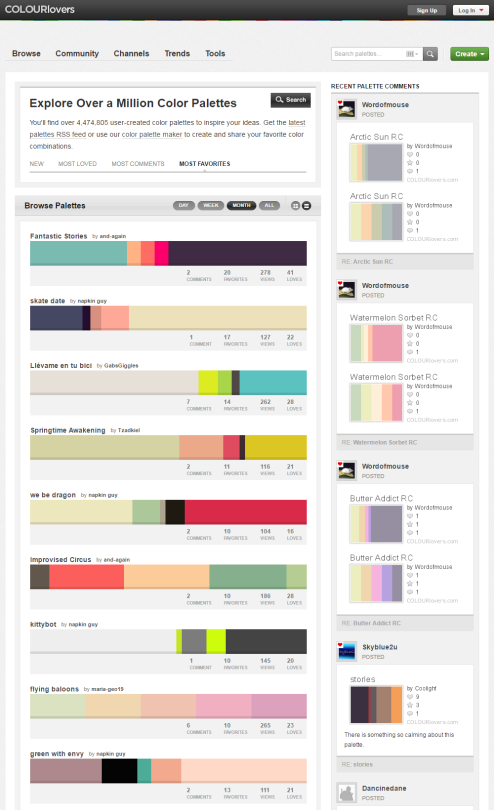
You can browse the most popular ones or search for certain colors, themes, and even specific hex codes!
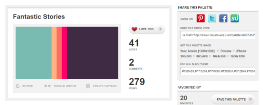
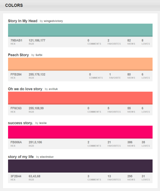
When you find one you like, you can download a wallpaper swatch of it and also select the specific colors it uses to look at more palettes that use those same ones.



 tumblr backup