Hello! this is an effect I see in a lot of artworks and that I use a lot, I tend to see new/younger digital artists (even others who are more experienced) asking me and others quite often how to do it but there doesn’t seem to be many tutorials for how to do it, especially not for Clip Studio Paint. I’m going to try to keep this simple as possible, cause it confuses tf out of me and i only just now learned how to do it in CSP lol
*This can also be/is usually done in Photoshop, but not everyone has photoshop, and there are already tutorials for it I think! Do what u gotta do!
First, comics are exhausting. Seriously like, dragging yourself over a bed of nails for 7 years straight exhausting. If you don’t passionately love what your comic is about and/or you don’t have a style that’s manageable and time-efficient, you’ll find it very difficult to produce your comic to completion.
@cooncomic is done in a super simple but efficient style. I use just Indian ink and a quill. I made it as manageable as possible so I wouldn’t grow exhausted with it over time because believe me, I get tired with even the simplest projects after the first 6 months months. SORRY I’M RAMBLING, THE POINT I’M GETTING AT: cut corners at every available opportunity. Find out the quickest, most efficient way to get the final product that you need. Even if that means relying heavily on digital touchups to support your traditional work.
I scan my pages as a .png (retains more data than a jpg) at 800dpi.
Sometimes the panels are ROUGH. Ink sometimes dribbles, it smears. And often I don’t want to wait an hour+ for large ink areas to dry, so I don’t even bother filling large areas in. I just wait to do it digitally.
Could I have gotten the edited version without using digital effects? Yes. But it would have been far more time consuming than was necessary. For me, the key to not getting sick to death of comic-making is to find a way to get a quality product without sacrificing time. But if I did the comic completely digitally, it wouldn’t have the same soul to it. Personally I don’t really enjoy working digitally and it shows–my traditional art has more personality.
After a page is scanned, I play with the tone curve and contrast until it looks how I want, white out the edges of the page so it’s clean, and then I draw on top with white, sometimes dark colours, for touchups. This differs for each page and depends on what you drew the comic in. Ink scans are easier to edit because ink is so harsh and bold, it’s easy to clean up. So here’s an example with pencil:
Jack with the tone curve tool until it looks contrasted enough. (I also white out the borders of the page where the scan gets darker edges)
Then, on a new layer, I draw on top of the page with white, doing touchups and cleaning up details that didn’t scan well. I always use a natural pencil brush so it looks traditional:
There’s no really right or wrong way to clean up traditional scans, just fiddle with it until you get to the product you want.
Traditionally drawn comics are really underrated, I wish there were more. Best of luck with yours!
I don’t use them for @cooncomic because the pages are very short and straightforward with the briefest dialogue. So for the sake of this answer, I’m talking about my more graphic novel style comic work.
Creating the layout of your panels and the composition within them is an art form in itself. It’s storytelling. You’re showing your audience your story. I always think more along the lines of cinematography than illustration for this.
I begin my composition with the last panel in mind. The final panel of your page–that’s your punchline. That’s your climax. It’s not at the middle, it’s at the end. That very last panel is the one I want to leave the viewer focused on. Awed by. Stung by. Melted by. Humored by. Offended by. Whatever the point of your storytelling was. So that’s where I start and where I put the majority of my focus. My final panel is the punchline that everything else will just be leading up to, whether it’s with the dialogue or just the imagery.
Then I have to come up with composition. How many panels do I need leading up to that final panel? How many snapshots will be necessary to set the scene, the setting, the mood? I need to portray these things in the most concise number of panels. So I do a series of thumbnails playing with different numbers of panels, different arrangements of panels, etc. Typically I do this traditionally, on scrap paper. Very quickly. Scribbles, stick figures. I’m just figuring things out. Unfortunately I don’t have many good examples of this to show, because they’re for upcoming projects I’ve yet to announce.
SUPER rough. I do this every time. I never start a serious comic page without testing compositions on thumbnails to help me pick the arrangement that best suits the flow of the storytelling. I need something that will best lead up to that final panel on each page.
Then I pick the thumbnail with the arrangement of panels I like best and redraw that thumbnail digitally, fleshing out the composition in each panel a little better. You can see examples of that in the top left of these pages I’ve done:
Some quick animation smear guides I put together for a friend! not sure if it works as a tutorial without my in person commentary, also more intended as a guide to show examples of basic/common smear types :O
…might make a tutorial on how to use smears another time…
Ever created a drawing you really love, then decided that you wanted to paint it in watercolor (or transfer it to another type of paper)?
Or, are you super frustrated with getting smudges and eraser marks on your crisp expensive nice paper.
Maybe you have a digital sketch you like, but you want to turn it into a traditional painting.
This is a tutorial to solve all of this.
Start with a sketch on plain cheap copy or sketch paper, then transfer it over like this:
First, take your sketch paper and un-attach it from your sketchbook, or print it to size if it’s digital.
Next, flip the paper over and put it on top of a light box, or against a window (so you can see through it). Take a graphite pencil and roughly trace the entire thing on the back. I’d recommend using HB graphite and a non-mechanical pencil.
At the end, it should look something like this.
Here is an example of what both sides look like, with a corner peeled over:
Now, attach it to your nice paper. Use tape on two corners (so it stays in place, but you can peel up some corners to check it).
Tips for easily released tape: Cut the tape to your desired length and put it on fabric, like your pants, and pull it off. Repeat a few times. The oils from your fingers plus the fibers will make it less sticky!
Here is it unattached, printed original sketch side up (not the graphite colored side):
See how the tape looks messy in the bottom photo? That’s what you want!
Now, trace the original side of your sketch with a ball point pen! You need a very sharp tip and to be able to see where you’ve drawn, so definitely use a ball point pen for this.
Use firm pressure!! (Your hand will probably be sore if you do this all at once). Make sure you’re on a hard surface, too.
Make a copy of your original sketch and use that to transfer, if you don’t want to ruin the original drawing.
And, when you complete the whole thing, you’ll have a light but visible transfer! Perfect for painting over. Here’s a sneak peek when I lifted a corner!
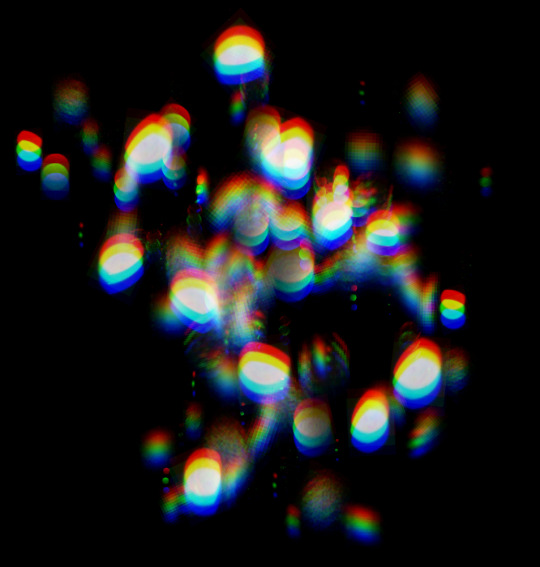
Hi! Happy Tuesday! Today’s tip is on one of my favorite subject, color theory; specifically on chromatic fringe.
It is the red fringe or hot saturated color you see at the edge of cast shadow and where it meets the light area. The rougher the object edge casting the shadow or the further away the object is, the more red fringe you’ll see. This is different than chromatic abberation, which is color fringing caused by lens failure. You can see chromatic fringe with your eyes. The more you paint from life and make observation, the easier it is to see. It’s one of those things that once you see it, you cannot unsee. 🙂 XO,
Griz
#griz #grizandnorm #tuesdaytips #colortheory #chormaticfringe #grizandnormtuesdaytips #grizandnormkittycatclub
ps. On stylized painting, where you want to have a hard edge on a shadow, you don’t always have to put it. Like everything in art, you can choose to put something in or not. But it’s always good to know your basic and know the rules before breaking it. Happy painting!
I got an ask about FA layers and so here are samples for each of them arranged in order of lineup on the drop-down menu!
tbh I only ever use the first four b/c the rest are pretty capricious?? Difference is a Wild Card that is Evil and unpredictable BUT the only thing you really need to know about it is that you can make negatives with it hoho
I actually don’t know how to make accurate gem-y things but the trick is to group the highlights and shadows in general areas so make it look like you know what you’re doing yanno